Type
Group Project
Role
Web Design, Branding, User Interaction
Design Tools
Figma, Framer, Procreate
Our time is no longer truly our own.
Commutes, toilet breaks, or just before you sleep - chunks of time disappear as you find yourself scrolling mindlessly.
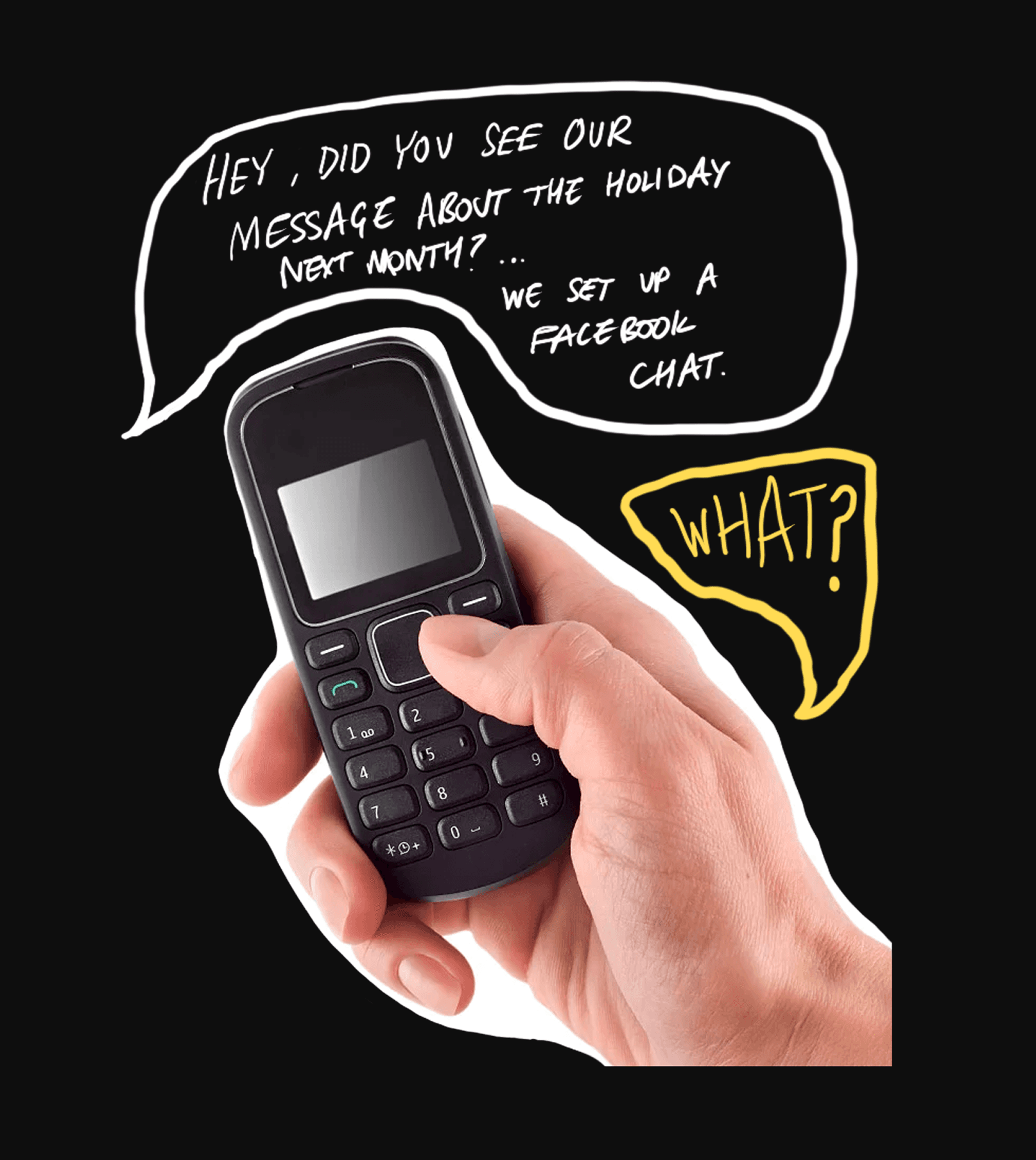
We tried all the “solutions” on the market, but they’re all built on a fundamental misunderstanding — screen addiction is not an individual problem, it can’t be solved alone.
Most screen time blockers are just speed bumps — ignored, overridden, forgotten. But while the apps were failing, something else was working: our friends swapping screen-time passwords, placing bets on whoever used Instagram the most. Embarrassment, accountability, a little bit of shaming — it was actually having an impact.
So we built Snitch around that idea: that what breaks doom-scrolling isn't discipline, it's community.
Branding & Identity
From the beginning, we wanted Snitch to go in completely the opposite direction as other screentime saving apps. In branding as well as product strategy. Whereas apps like ScreenZen, Forest, and Opal leaned into the mindfulness aesthetic - promoting peace of mind and conjuring up images of wellness and nature - we wanted to be brash, loud, and cheeky.
I came up with the name Snitch - it being an appropriate name in the early stages of the app when we leant more into the idea of shaming people for doom-scrolling. Though our mindset on how to actually help combat addiction changed with time - Snitch remained a natural (and very catchy) name to stick with.
I also designed the logo - taking inspiration from the 'Kilroy was here' graffiti that sprouted throughout World War II. It feels as though the character is watching and inspecting your every move, as we would hope your friends would do to help you get off TikTok!
The website and other promotional materials leaned into this DIY, collage aesthetic that we knew would resonate with people our age. We were not trying to act business-like and professional - but instead to cultivate a kind of movement.



Web Design
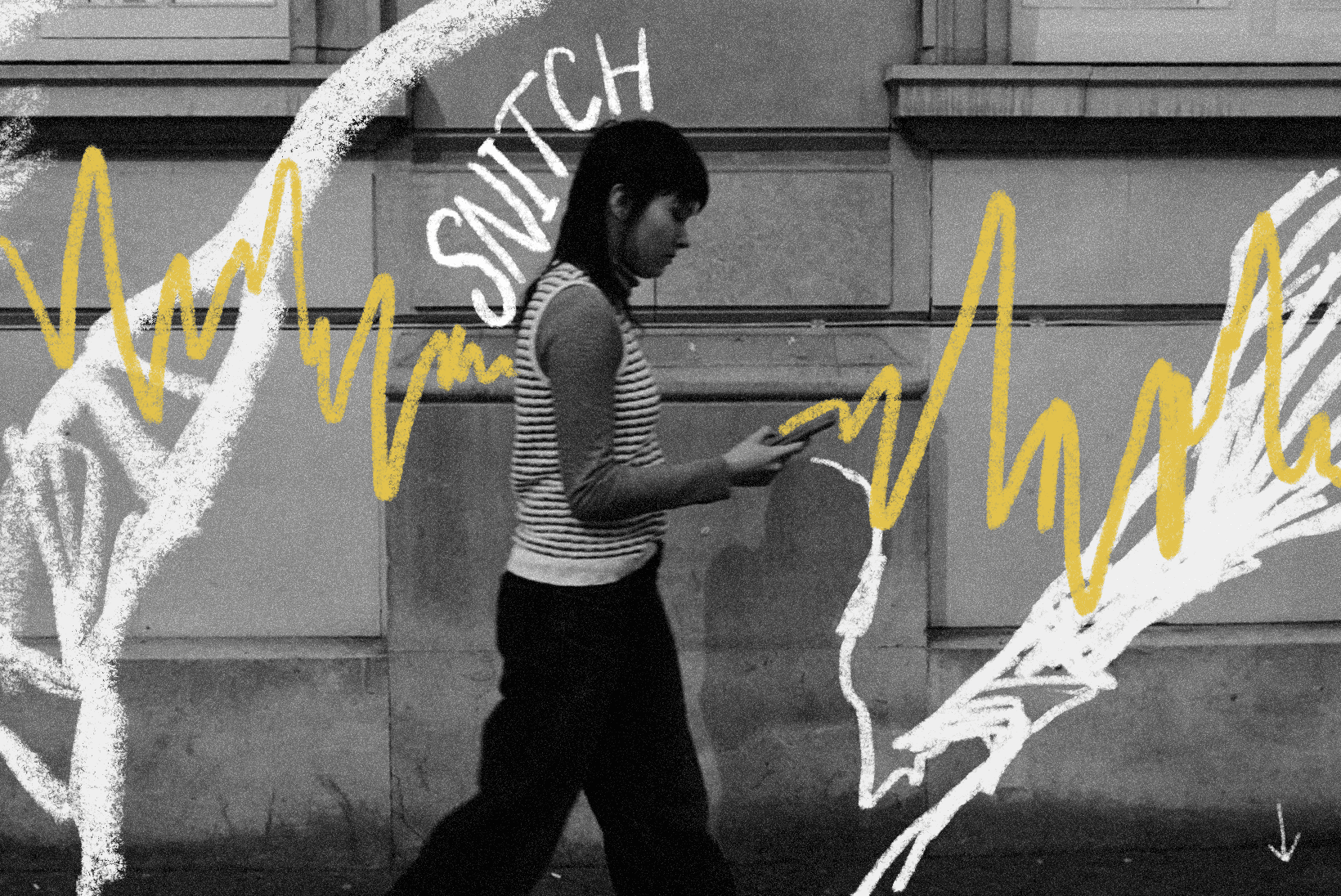
The main deliverable, after 24 weeks of work, was a public and investor facing website encapsulating all the work we had done so far. For the public we kept it simple, a single landing-page to capture attention, explain what we are doing and drive early sign-ups to the mobile app. For investors we dive into our GTM strategy, P&L sheets, assumption validations, and all things business. Fifteen pages of research and strategy condensed from two terms of work - built on Framer in two weeks.



App Onboarding
My final contribution to Snitch was creating the onboarding flow for the iOS app.
After filling in their personal details - we wanted users to answer 'why' they felt they needed to cut down on doom-scrolling. Acknowledging their goals before reaching the app-blocking stage serves a deliberate purpose: shifting the interaction from a mechanical set-up task to a moment of intention-setting.
Users then set their preferred time limits, as well as acknowledging how much time they think they currently spend. The user commits to a time-saving goal, and it helps us track their progress. This information is gathered prior to the 'Join Group' stage - so that we can identify a public group with similar goals for them to join, should they not want to create their own or join a friend.